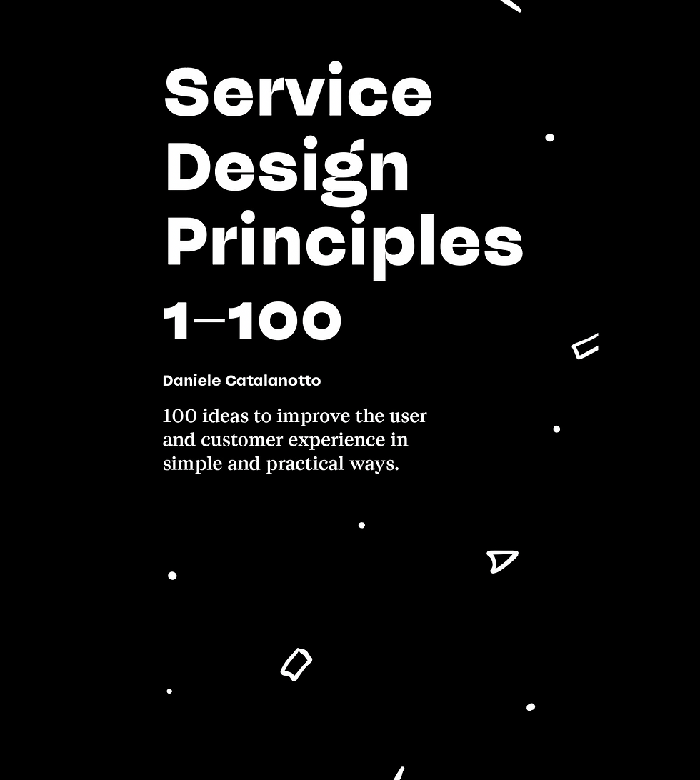
‘Service Design Principles: 1-100’ is a book that’s a little different to many others on the topic: instead of being aimed at practicing designers, it declares itself to be a ‘handbook for business owners who don't give a fuck about Service Design and need practical rules of thumb’. Nice. Even so, I couldn’t resist a look and found much that was thought-provoking and entertaining too.

Daniele Catalanotto, Service Design Principles 1–100: 100 ideas to improve the user and customer experience in simple and practical ways, November 2018 (Kindle Edition)
True to its stated purpose, this short book comprises 100 ‘tiny and simple’ design principles for making services a little ‘less shitty’ for their end users. Each of the principles is described succinctly in only a couple of paragrpahs of large print or less, and made relatable through everyday examples - usually highlighting what happens when the principle is not adhered to! A real strength of the book is its breadth, as the principles selected range across many aspects of services, whether that be employee or customer experience, and real-world or digital interaction. The author also frequently draws on recent studies in the fields of psychology and behavioural economics, helping to provide some fresh perspectives on familiar issues. I also enjoyed the drily-humorous style. My only slight gripe (with the Kindle version at least!) is that ‘Principle’ is misspelled for each and every of its 100 occurrences. Whoops.

What follows are 7 of the principles from the book that I found most interesting, memorable and aptly described!
Principle 8 - Do the Penis Test and Think About What Could Go Wrong.
A service putting two random people in contact via video seemed like a cool idea until people starting showing their penises. The lesson is - always think about what could go wrong!
Principle 19 - Stupid Aquariums Make People Forget Time.
Waiting rooms are pretty tedious, but are better with some entertainment. ‘And for that, we don’t need expensive ideas—a simple and stupid aquarium works well.’
Principle 30 - Making It Digital Won’t Make It Smarter.
The author describes how a coffee shop he frequented went from a paper fidelity card to a digital one with a QR code. ‘The problem with this “upgrade” is that now I don’t have any idea when I will receive my gift. I could check with my smartphone. I could take it out, find a QR code scanner app. Install it and then scan the QR code. And then discover that I am far away from the gift. But I’m lazy! In fact, I haven’t scanned that dumb QR code even once.’ The moral here is, if something works in a non-digital form, then don’t bother making it digital just for the hell of it.
Principle 51 - Always Look for the People Who Accompany Your Users.
To highlight this principle, the author describes how when he accompanies his wife on shopping trips, he often find himself standing and waiting in the middle of the store, with ‘no place to sit comfortably’. The result is that when his wife asks him to go again, he tries to postpone it for as long as possible, which is bad for the shoe shop. The moral? ‘Always look for the people who come with your users or customers.’
Principle 69 - Beauty Reduces Pain.
A paper published in a psychological journal suggested that when hospital patients were showed paintings they described as ‘beautiful’, they then felt reduced levels of physical pain. The lesson for services is that ‘bringing beauty back to your products or services will make these services less painful for your customers’.
Principle 89 - 90% of Your Website Content Is Useless.
Author Gerry McGovern collected a few examples that show that less content means more conversion. The Columbia University of Chicago deleted 97% of their pages. Student application inquiries went up by 80%. Wow.
Principle 97 - Start with the Boring Stuff Then Excite Me Little by Little.
This principle suggests that when designing a service, ‘start with some boring stuff’ so that then when you get to the good bit ‘the user experiences become a firework’. That is the way to ensure that an “aha” moment is actually experienced as an “aha” moment.
Comments